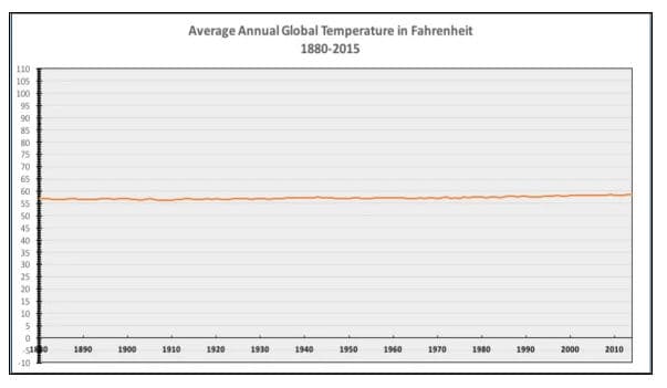
The graph below originated with the Powerline blog in December, 2015 and was identified by National Review on December 14th, 2015 as “The Only Climate Change Chart You Need to See”. This description became controversial, the subject of articles at The Washington Post, the Huffington Post, the New Republic and other “progressive” media. The Washington Post asserted that the chart showed the global average temperature anomaly on a temperature scale 50 times too great, comparing it to plotting the US National Debt on a chart with a “Y” axis of $0 - $900,000,000,000, even though the US National Debt has not yet exceeded $20 trillion.

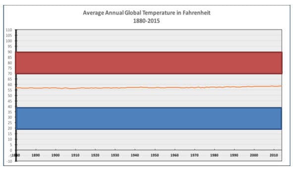
However, the graph actually plots the average global annual temperature estimate over the period of the instrumental temperature record with a “Y” axis representative of the normal range of annual temperatures for a mid-latitude city, such as Wichita, KS as shown in the graph below, reproduced from my previous commentary “Additional Perspective”. The red shaded area on the graph below is the typical range of daily temperatures for the month of July, while the blue shaded area is the typical range of daily temperatures for the month of January in Wichita. Each shaded area represents a diurnal temperature range of approximately 20oF, or more than 12 times the estimated increase in the average annual global temperature over the 135 year period shown in the graph. The difference between the warmest and coolest monthly average temperatures shown in the shaded areas shows an annual average temperature range of approximately 70oF, or approximately 43 times the estimated increase in the average global annual temperature over the period.

Daily high and low temperatures in Wichita can vary by more than 30oF; and, record high and low temperatures are 114oF and -22oF.
The graph “Y” axis does not extend to include the maximum and minimum temperatures experienced in the individual states of the United States, as shown in these graphics from NOAA, and certainly does not represent the extreme temperatures experienced in other areas of the globe, which range from 136oF to -126oF (approximately twice the range of the “Y” axis in the graph). Were the graph plotted with a “Y” axis representative of the maximum range of temperatures experienced around the globe, the increase in the average global annual temperature estimate would be barely visible.
During a typical year, especially during the Summer and Winter, the individual measuring station temperatures which are combined to calculate the average annual global temperature are tens of degrees Fahrenheit warmer and colder than the average annual global temperature, spanning the entire range of the “Y” axis of the graphs above. Therefore, it is either ignorant or duplicitous to suggest that the “Y” axis in these graphs is inappropriate or misleading.
The intent of the graph is to illustrate the relationship between the ~1.6oF increase in average annual global temperature over the period of the instrumental temperature record and the much larger changes in diurnal and seasonal average temperatures regularly experienced in the mid-latitudes. It clearly portrays a very different scenario than the graphs with severely truncated “Y” axes typically used to emphasize the rate of increase of the average global annual temperature, such as the graph included in the article in The Washington Post.

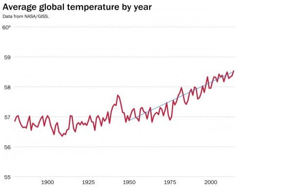
The graph above does show the annual natural variation in the average global temperature estimate relative to the overall average increase in estimated temperature asserted to be the result of increased atmospheric CO2 concentrations, represented by the black line extending from the 1950 average global temperature estimate to the final point in the graph. The slope of the line is approximately 2.5oF per century, though the slopes of the year to year natural variations are significantly greater.